
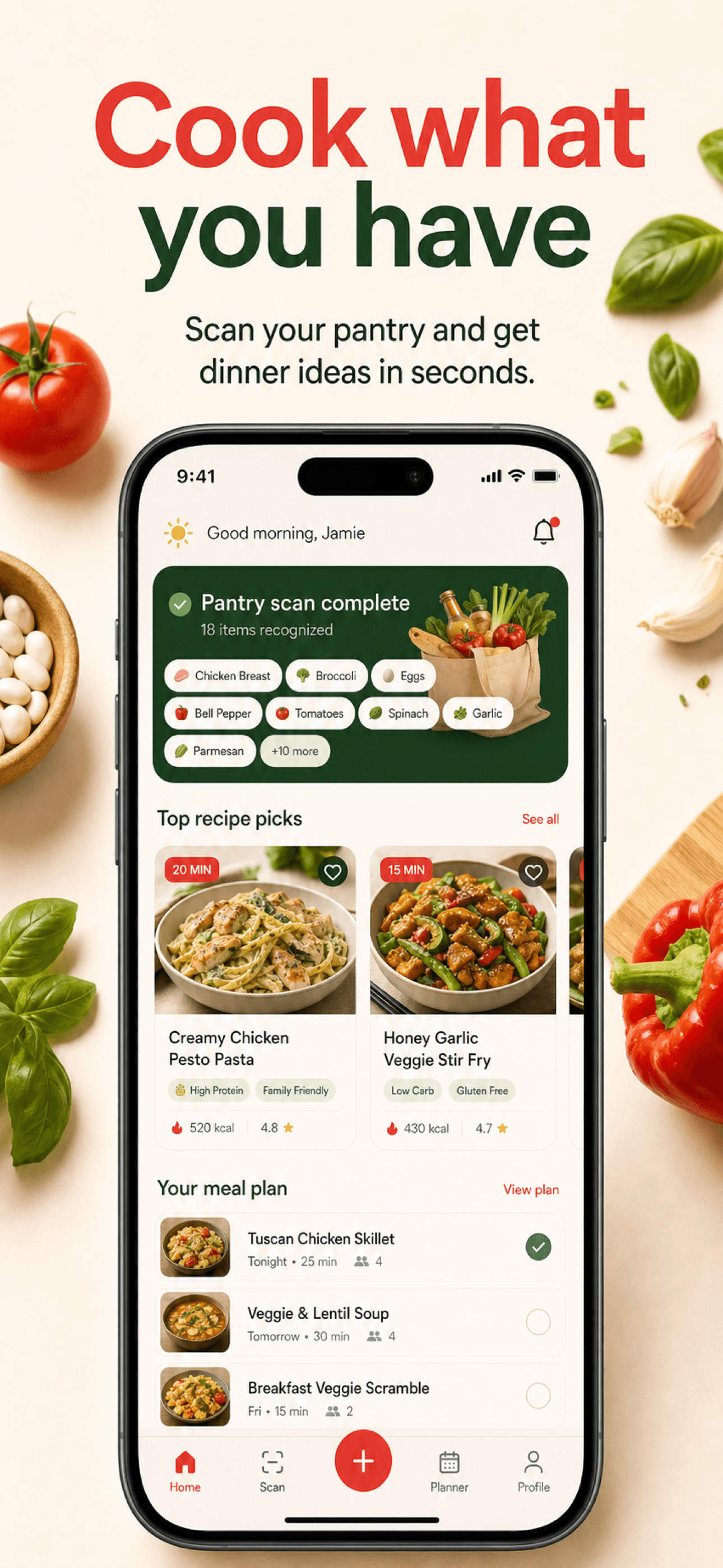
How to create App Store screenshots step by step
You can use a design editor or StoreScreens.ai to turn your app brief and reference screens into store creatives. Start with this six-step workflow, then review every design against your actual product.
Choose your strongest app screens
Capture the current interface in useful, realistic states. Keep the source images.
Identify one benefit per screenshot
Match each user outcome to a screen that demonstrates it.
Write short, benefit-led headlines
Say what the user can do or achieve. Remove words that do not help explain it.
Create a consistent sequence
Reuse typography, spacing, colors and device treatments while giving each screen a different role.
Validate dimensions
Check the accepted pixel sizes for each device class your app supports.
Export for the App Store
Export JPEG or PNG files without transparency, review them at small size, then upload and check their order in App Store Connect.
Which app screens should you choose?
A screenshot set is not a gallery of every feature. It is a short sales sequence. Decide which user problem the app solves, which outcome matters most, and what proof the interface can show. That decision gives the first screenshot a clear job and prevents later screens from repeating the same message.
Capture the real product first
Prepare clean product states before adding frames or marketing copy. Use realistic data, remove test labels, close keyboard overlays, and keep status bars consistent. Each capture should prove the claim that will sit beside it. If the headline promises faster planning, show the planning interaction or its useful result.
- Use the current production interface
- Remove personal and test data
- Keep time, battery, and status bars consistent
- Capture the state that proves the benefit
- Use a repeatable device and viewport setup
- Save source captures before adding decoration
What should your first 3 screenshots communicate?
Give every screen a distinct role. A practical sequence starts with the main promise, follows with proof, shows the most important workflow, answers a likely objection, and ends with a supporting capability. You do not need to fill all ten App Store slots. Use only the number needed to tell a complete story.
Apple explains that, depending on orientation, the first one to three screenshots may appear in search results when no app preview is available. Make the opening understandable on its own. For a meal-planning app, give each of the first three screens a distinct job:
Cook what you have
Show the pantry and a useful dinner suggestion.
Find tonight’s recipe
Show a recipe matched to available ingredients.
Plan the week ahead
Show a completed meal plan, if the app supports it.
Pair a headline such as “Cook what you have” with a pantry interface that supports the promise. Only include recipe matching or weekly planning if your app actually provides it.
How should App Store screenshot headlines be written?
Keep the headline short enough to understand at thumbnail size. Lead with the user outcome instead of the internal feature name. Supporting copy should clarify the claim, not repeat it. Read the set in order with the app UI hidden. If the story still makes sense, the message hierarchy is working.
For example, replace an internal label such as “Pantry scanner” with “Cook what you have” when that outcome is supported by the app. Avoid unverified claims like “the fastest” or “save hours.” Keep essential meaning in the headline; use smaller copy only for helpful detail.
How do you make the screenshot set feel consistent?
Choose one type scale, one spacing rhythm, one background family, and one device treatment. Keep important copy inside a generous safe area so the design can adapt to other device ratios and languages. Consistency should come from the system, while each screen keeps a distinct message and composition.
Correct screenshot sizes
Use the free App Store Screenshot Size Checker to inspect the final files on your device. It reports exact dimensions and file issues without uploading your screenshots.
App Store Connect accepts specific pixel dimensions for each display slot. Export from a master layout into the accepted iPhone, iPad, and Apple Watch dimensions you support. Do not stretch one finished JPEG into a different ratio. Reflow the layout and check the result at its final pixel size.
Two accepted portrait export choices are 1290 × 2796 px for iPhone and 2064 × 2752 px for iPad. The App Store Screenshot Sizes guide explains the full device requirements and scaling rules. For icons, previews and other platforms, use the App Store Asset Sizes reference.
How StoreScreens.ai simplifies the process
The App Store screenshot generator starts from an app brief. Describe the audience, the main benefit and the screens you want to explain. You can add reference images to guide generation, generate copy and screenshot designs, and review or regenerate the results in your project.
Keep the same creative direction across the set. The editor supports translation into other languages and downloading individual screens or a ZIP of the set. Check translated text and every generated interface against your real app before publishing; a generated image is not proof that a feature exists.
AI vs manually designing screenshots
Manual design gives you direct control over typography, layers and precise placement, but you prepare the layouts and variations yourself. AI can help explore copy and visual directions from a brief, with less blank-canvas work. It still requires editorial judgment and a product-accuracy review. Use the approach that gives you an accurate, readable set you can maintain as the app changes.
To see those approaches side by side, compare StoreScreens.ai and AppScreens. Once your set is accurate and readable, use the screenshot optimization guide to plan what to test.
Common mistakes to avoid
- Opening with a logo or menu instead of a useful product outcome.
- Repeating the same benefit across several screens.
- Using tiny copy or cropping away the interface that proves the headline.
- Stretching a phone composition to fit an iPad ratio.
- Publishing test data, personal details or invented AI-generated controls.
- Leaving translated headlines unchecked for meaning and fit.
For more composition guidance, read our screenshot best practices. When preparing another language, follow the localization guide.
Export and run a final store-ready review
Review the full sequence on a phone-sized display, not only on a large design canvas. Check spelling, product accuracy, text contrast, localization, file format, dimensions, and order. Then compare the uploaded preview in App Store Connect with the exported source files before submitting the app version.
- One clear promise in the opening screen
- A different role for every later screen
- Readable text at thumbnail size
- Real product UI that supports each claim
- Accepted dimensions for every target slot
- Final review in every published locale