
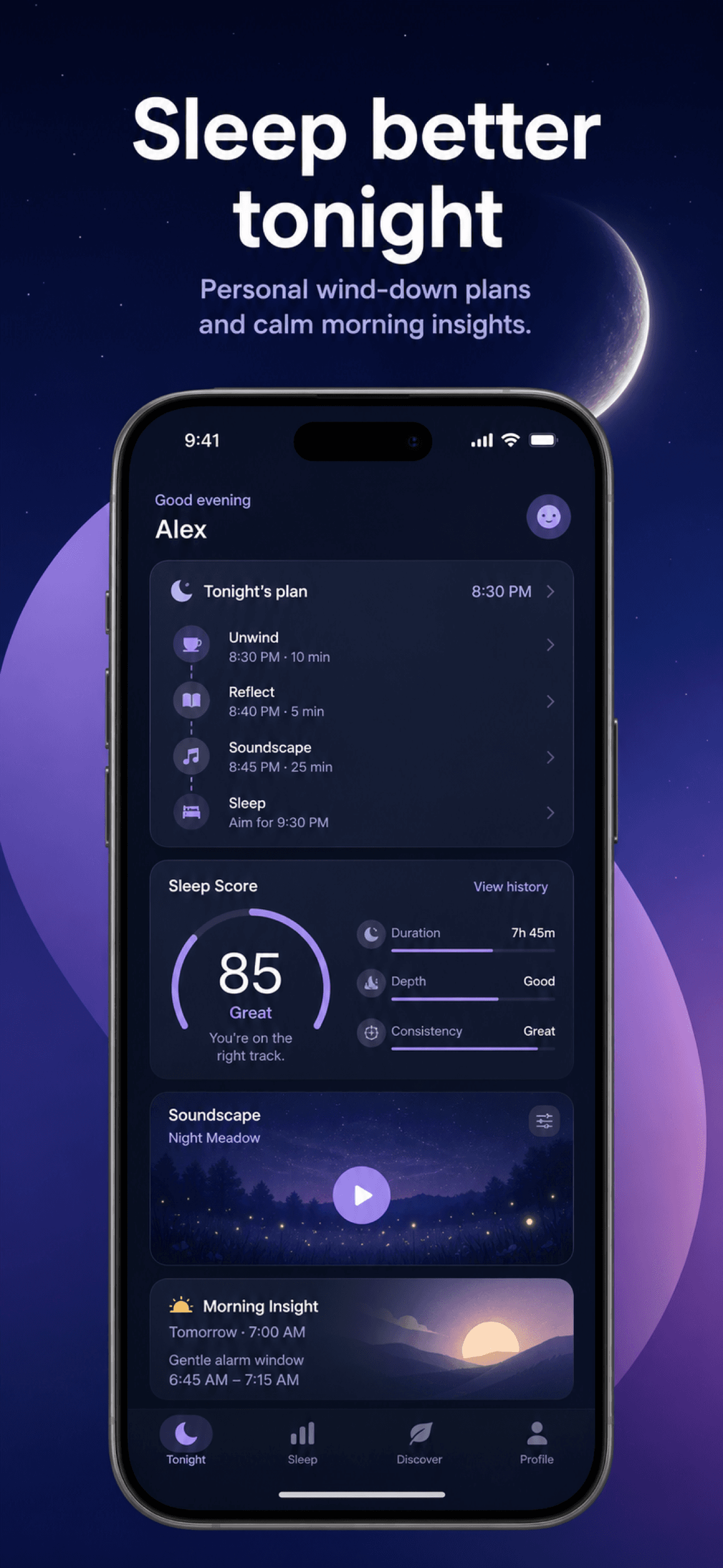
Start with a clear screenshot production workflow, then apply these composition checks to your set in StoreScreens.ai. The free size checker can help catch export mistakes after your visual review.
Make the opening screenshot understandable by itself
The first screenshot should explain the app's main value without relying on the description below the listing. Use one concrete outcome, a product state that proves it, and a visual hierarchy that works when the image is small. Save secondary features and edge cases for later screens.
Give every screenshot a different role
Repeating the same phone frame with a different caption creates volume, not persuasion. Build a sequence where each screen adds new information: the promise, proof, core workflow, useful detail, trust signal, or supporting capability. Remove any screen that does not move the story forward.
- Lead with the strongest user outcome
- Use one message per screenshot
- Show the interface that proves the claim
- Keep the sequence visually consistent
- Use concise, readable headline copy
- Finish with a complete product story
Design for the size people actually see
App Store visitors often scan screenshots before opening them full size. Check the set at a small viewport and make sure the main headline remains readable. Avoid thin type, long paragraphs, low contrast, and small interface details that only work on a desktop canvas.
Keep important content inside a safe composition
Leave breathing room around headlines, devices, and key interface details. A flexible composition adapts more safely across accepted display sizes and localized text. Do not place essential copy against the edge of the exported image.
Use benefit-led copy with specific proof
Feature names make sense to the team that built the app. Outcomes make sense to the person deciding whether to download it. Replace labels such as "Advanced planner" with a useful result such as "Plan the week in minutes," then show the relevant planning view.
Localize the design, not only the sentence
Text expands, line breaks move, and reading direction can change. Build layouts that can accept longer copy, then review every localized export in context. Keep the message natural for the market instead of forcing a literal translation into an English-sized text box.
Test a meaningful hypothesis
Apple Product Page Optimization can test alternate screenshot treatments. Change one strategic variable at a time, such as the opening promise, message order, or visual emphasis. Keep the rest of the treatment stable so the result can guide the next decision.
How to improve App Store screenshots you already have
Auditing a live listing? Work through it in this order: check that the first screenshot passes a five-second test, rewrite feature labels into outcomes, confirm your exports still match Apple's accepted dimensions in the App Store screenshot sizes guide, then measure the effect of each change with the workflow in our ASO screenshot optimization guide. When a redesign is faster than a repair, the App Store screenshot generator builds a fresh, coherent set from your existing listing in minutes.
- Preview the set at phone size
- Check contrast in light and dark artwork
- Verify every claim against the live app
- Review line breaks in every locale
- Export only accepted pixel dimensions
- Test one strategic change at a time