
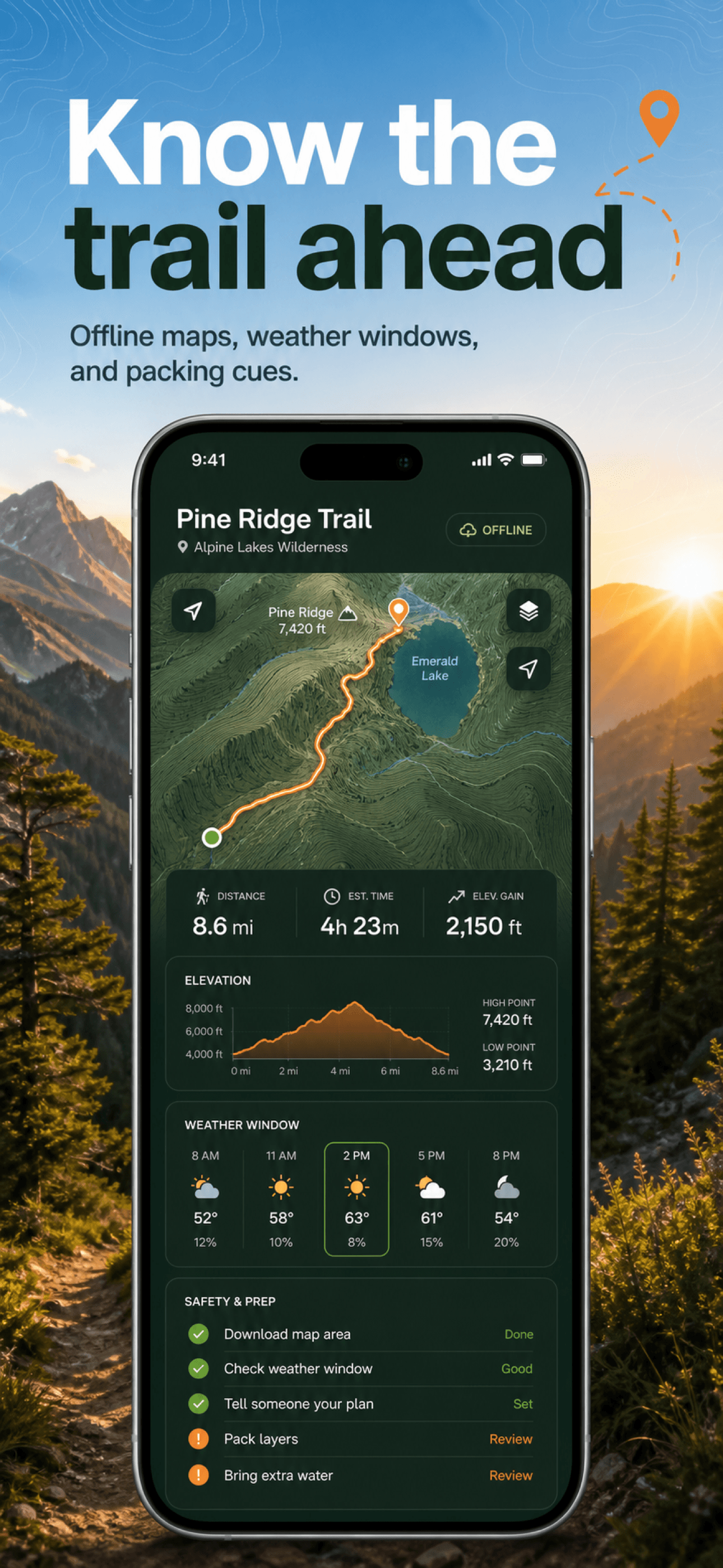
Use StoreScreens.ai to create the screenshot portion of a cross-platform release. Keep the Apple visual asset reference alongside this comparison when your release also includes icons or App Preview videos.
The short answer
App Store and Play Store screenshots differ in four practical ways: how many you can upload (up to 10 per localization on the App Store, 2 to 8 per device type on Play Store), which dimensions are accepted (Apple publishes exact pixel sizes per device class, Google accepts a flexible range), which extra assets are required (Play Store requires a 1024×500 feature graphic, Apple has no equivalent), and how changes go live (App Store screenshots ship with a version submission, Play listing updates are reviewed independently of app releases). The message strategy can stay the same across both stores; the production details cannot.
Side-by-side comparison
| Requirement | Apple App Store | Play Store |
|---|---|---|
| Minimum screenshots | 1 per required device class | 2 across supported types |
| Maximum screenshots | 10 per localization | 8 per device type |
| Dimensions | Exact accepted sizes, e.g. 1290 × 2796 iPhone | Flexible: sides 320 to 3840 px |
| Aspect ratio | Fixed by the accepted sizes | No more extreme than 2:1 |
| Tablet assets | iPad sizes, e.g. 2064 × 2752 | 7″ and 10″ tablet sets recommended |
| Extra required asset | None | Feature graphic, 1024 × 500 |
| Wearable devices | Apple Watch sizes accepted | Wear OS handled separately |
| Built-in A/B testing | Product page optimization | Store listing experiments |
Dimensions: exact sizes vs accepted ranges
Apple rejects uploads that do not match an accepted size for each device class, which is why teams pin exports to dimensions like 1290×2796 px for iPhone. Google instead validates that each side falls between 320 and 3840 px with a sane aspect ratio, and recommends 1080 px or more on the short side for promotional eligibility. The exact tables live in our App Store screenshot sizes and Play Store screenshot sizes guides.
Device coverage: two different matrices
An Apple listing spans iPhone, iPad, and optionally Apple Watch, Mac, Apple TV, and Vision Pro, each with its own accepted sizes. A Play listing spans phones plus 7-inch and 10-inch tablets, with large-screen quality directly affecting recommendation eligibility. Plan for at least two layouts per store: handset and tablet, using real UI for each form factor rather than a stretched phone capture.
The feature graphic only exists on Play Store
Play Store requires a 1024×500 feature graphic that fronts promotional placements and acts as the video cover. Apple has no equivalent asset. If you plan one set of visuals for both stores, budget this extra deliverable for Android from the start, and design it as a single bold brand statement rather than a resized screenshot.
Testing tools differ, the discipline does not
Apple's product page optimization tests up to three treatments against your current page. Google's store listing experiments test listing variants directly in the Play Console. Both reward the same discipline: change one meaningful thing at a time, run long enough to reach significance, and keep the winner as your new control. Our ASO screenshot optimization guide covers this in depth.
Shipping both stores without doubling the work
The practical cost of two stores is not creativity, it is production: two dimension systems, two device matrices, and localized copy multiplied by every language. Storescreens generates both sets from one brief, with the same visual style applied through the App Store screenshot generator and the Play Store screenshot generator, and exports organized by store, device, and language.