
Where screenshots sit in ASO
App store optimization has two halves. Keywords, titles, and metadata decide how many people see your listing. Screenshots, icon, and preview media decide how many of them install. Most teams over-invest in the first half and leave the second to whatever assets shipped at launch — which is why screenshots are usually the cheapest conversion win in the whole ASO stack. In both stores, screenshots are also visible before anyone opens your full listing: in App Store search results and across Play Store's browse and recommendation surfaces.
What actually moves install conversion
The first impression does most of the work
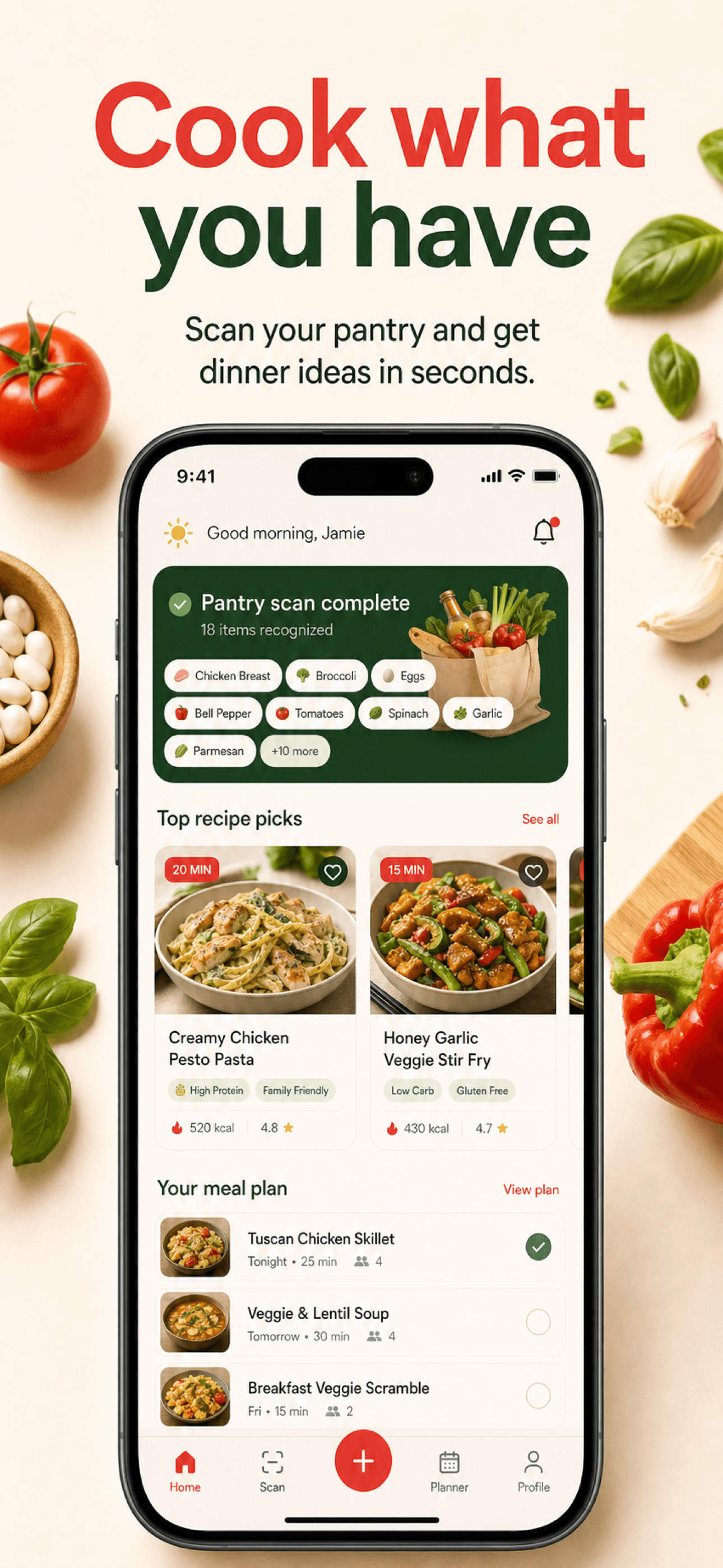
Users decide in seconds, often directly from search results without ever opening the listing. Your first one to three screenshots must carry the entire pitch: what the app does, why it is better, and what it feels like to use. Never spend screenshot one on a login screen or a settings page.
Benefit-led headlines beat feature lists
“Fall asleep faster” converts; “Sleep tracking module” describes. Write the outcome the user buys, then let the UI in the frame prove it. Keep headlines to a handful of words and readable at thumbnail size.
Sequence like a sales page
Promise first, proof second, daily-use moment third, supporting features after. Each screen should answer the next question a skeptical user would ask. A set with a planned order consistently outperforms a random gallery of app views.
Stay honest
Both stores require screenshots to reflect the real product, and users punish bait-and-switch visuals with uninstalls and reviews. Conversion built on fake UI is churn wearing a costume.
- First screenshot states the core promise
- Headlines readable at search-result size
- Order follows promise, proof, daily use
- Visuals match the shipped product
- Localized sets for top markets
- Refresh after major redesigns or pivots
Test with the stores' own tools
You do not need to guess which set converts. Apple's product page optimizationtests up to three alternative screenshot treatments against your current product page, splitting App Store traffic between them. Google's store listing experiments do the same for Play listings from the Play Console. Two rules keep results meaningful: change one variable per test — the first screenshot, the headline style, or the background system — and let the test run to statistical confidence instead of calling winners early.
Before testing an Apple screenshot variant, confirm its accepted export dimensions and check the file with the local screenshot checker. A dimension check catches a different class of problem from a visual or messaging review.
For descriptive research into layout and messaging patterns, read the StoreScreens screenshot study methodology. Its planned observations are separate from conversion experiments; no research findings have been published yet.
Measure the right numbers
The metric that matters is view-to-install conversion, not downloads alone. In App Store Connect, watch conversion rate across product page views alongside impressions. In the Play Console, compare store listing acquisition conversion before and after each asset change. Seasonality and featuring spikes distort short windows, so compare like-for-like periods.
For the production steps behind a variant, follow our screenshot creation guide. StoreScreens.ai can help you explore a new visual direction while you keep the testing hypothesis focused. The screenshot resource hub connects the design, localization and release guides when you need the next step.
Optimization is cheaper when iteration is cheap
The real blocker to screenshot testing is production cost: every variant means new layouts, copy, and exports across devices and languages. Storescreens collapses that loop — regenerate a single screen, try a different visual direction, or produce a full alternative set from an adjusted brief, then export store-ready files for the App Store and Play Store in minutes. Design details per store live in our App Store and Play Store best-practices guides.